
A lithograph copy of this poster image from 1925 by Charles Paine is in the Hearsum Collection.
It was part of a continuing campaign to increase passenger traffic on the Underground network by persuading Londoners to use their leisure time for day trips and weekend jaunts to historic houses, museums, suburban beauty spots and parks. As early as 1908 Richmond Park was promoted as somewhere ‘for Walking, Boating, Punting, Picnics and Other Jollities’.
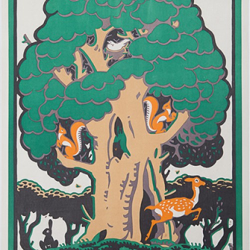
Such promotion included colourful images of London’s attractions, as seen in this poster by Charles Paine (1895-1967) who designed over 20 posters for London Underground in the 1920s. He was a versatile and prolific designer, having started his training in stained glass, which led him to concentrate on strong colours and simplified images.
For this image for Richmond Park Paine used the oak tree as the central motif for his bold, stylised design. No additional text was included in the final poster, which is a classic example of soft sell advertising, presenting an attractive destination without specifying a method of travel.
During the 1920s and 30s London Transport developed a strong and distinctive visual identity based on a culture of good design. It was driven by Frank Pick (1878-1941) who became the Underground’s Managing Director and later the first Chief Executive of London Transport. Pick commissioned top designers and artists, such as Graham Sutherland and Man Ray, to produce over 40 posters a year during this period, reaching a peak of stylistic quality.